> case files / mon valley
Case file 005 · Logo + line
Mon Valley
A valley of river towns, each doing its own thing. One logo that says they’re in this together.
CONCEPT
Onwards and upwards.
Dozens of small towns line the Monongahela, and each one tries to do its own thing.
A brush-script logo and a line for the valley as a whole, not any one town.
A finished identity concept, October 2026, ready to fly on a lamp post.
01The idea
Follow the Mon upriver from Pittsburgh and you pass one small town after another: Charleroi, Monessen, Donora, Monongahela and a long list of others. Each has its own logo, its own slogan and its own plan, and each is working hard on its own.
The idea behind this identity is simple: it isn’t about Charleroi, or any single town. It’s about the greater whole. A visitor, a new business or an investor doesn’t think in borough lines. They think “the Mon Valley.” So the valley gets one logo that every town can fly.
02The logo
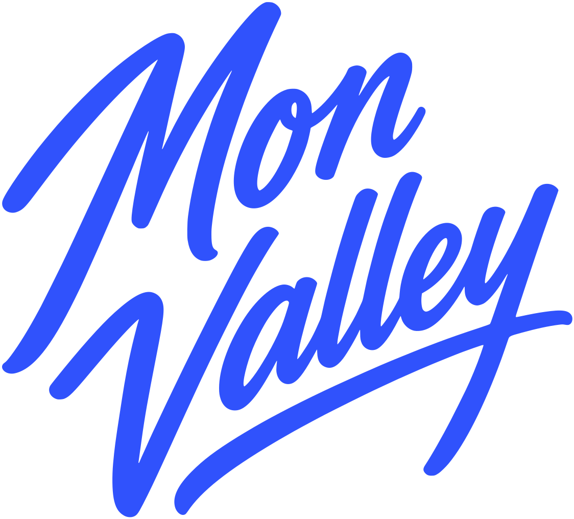
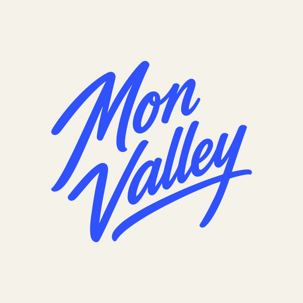
“Mon Valley” is set in a fast, slanted brush script, the kind a sign painter would put on a storefront window on any main street in the valley. It’s friendly and a little proud, not corporate.
Underneath runs the river: the tail of the “y” becomes one long stroke that sweeps under the whole name and rises to the right. One line under every town, heading north.
 96px48px32px
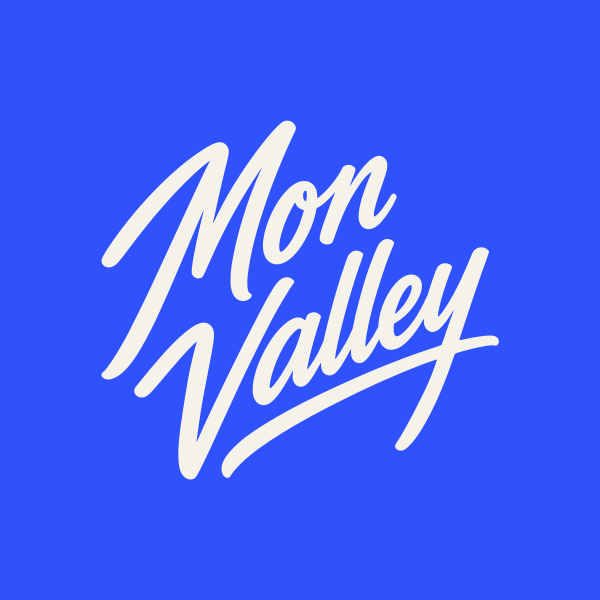
One color and confident strokes, so it holds up stitched on a hat, cut from vinyl or painted on a window.
The symbol
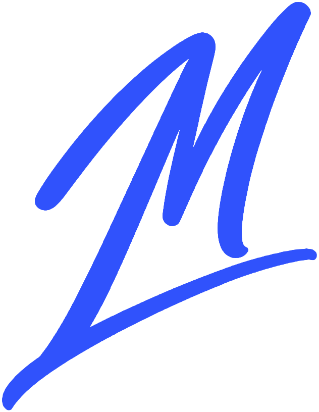
For the places the full logo won’t fit, like a favicon, an app icon or the side of a hat, there’s a symbol: the “M” from “Mon,” with the swash from under “Valley” crossing its foot and rising to the right. Nothing is redrawn. It’s cut straight from the logo, so the two always match.
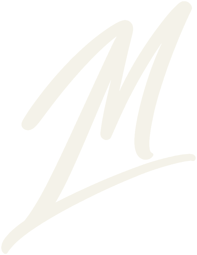
 64px32px16px
03The line
Onwards and upwards. The Monongahela is one of the few major rivers in the U.S. that flows north. Go with the current and you are, quite literally, heading up the map.
It works on a second level too. It’s what you’d say to a friend after a hard year, and the valley has had a few of those. It’s a promise about direction, not a claim about where things are today.
04Color
Two colors and nothing else. Every town can use them, and nobody has to choose.
05In the wild
Every town on the Mon already hangs banners from its street lamps. Here’s the idea: the same banner, up and down the valley. Each town keeps its own name at the bottom. The rest is shared.
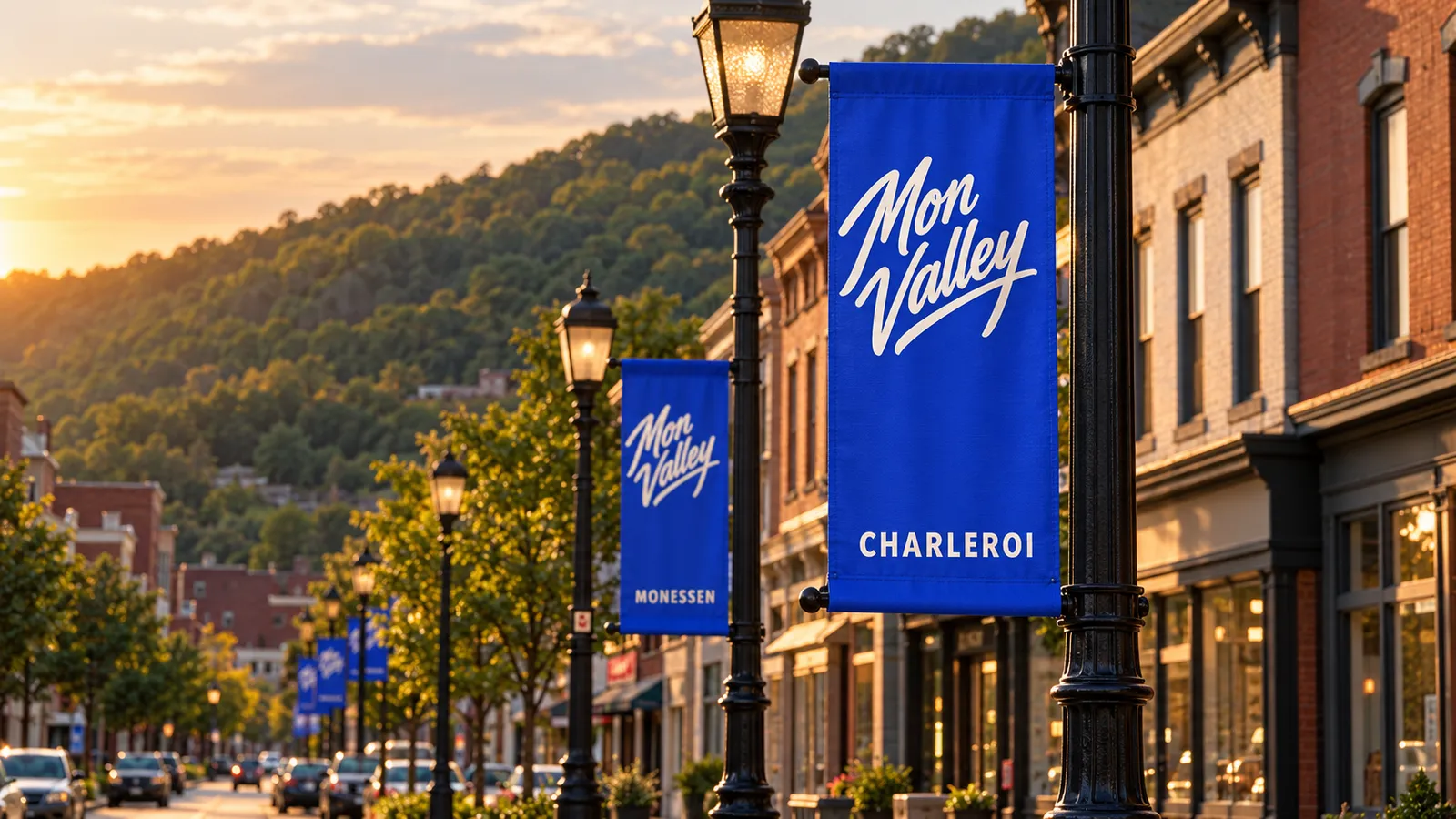
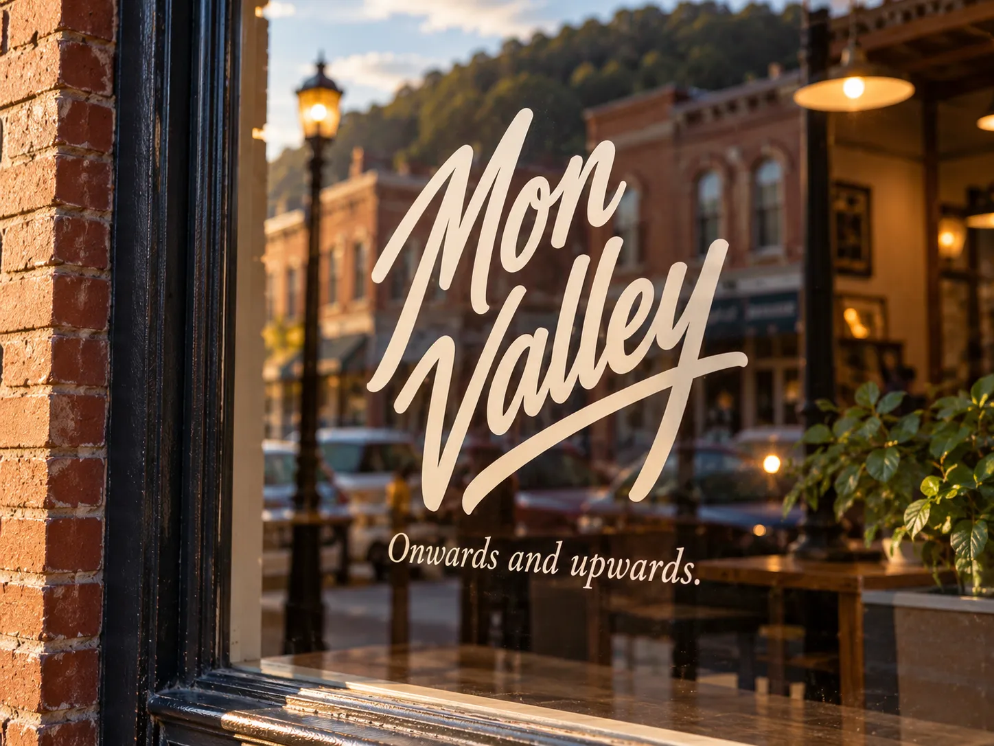
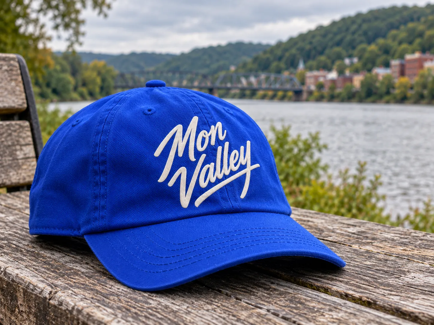
Mockups made with AI image generation, not real installations. The towns and streets are illustrative.
06What Swamp Kitten did
- Concept: one identity for the valley as a whole, not any single town
- Logo: “Mon Valley” in brush script, with the river running underneath
- Symbol: the “M” and the swash, cut from the logo, for icons and small spaces
- Line: “Onwards and upwards.”
- System: two colors, the logo on both, and the shared lamp-post banner